Designer Tips & Tactics
Drapery workroom owner, Paula Fioretti takes us inside her client’s Lake Forest, Illinois home to show how it was birthed to life using thoughtful design tactics. The master bedroom suite started with gray walls and an inspiration piece { a beautiful crystal chandelier }. The room quickly evolved by adding a black four-poster bed, night stands, artwork, crisp white linens and white drapery panels.
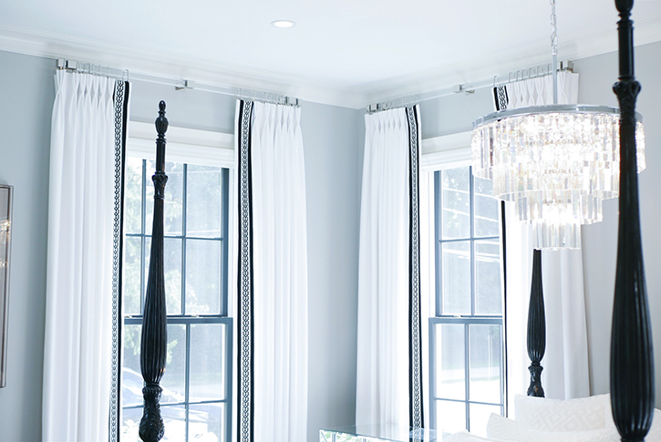
Curtains take up a large amount of visual space and will have a huge impact on the look of a room.
“When working with an oversized room with lots of windows (in this case, SIX), the window treatments naturally become a focal point. For this reason, they have to be spectacular.” Paula wanted to make a statement. She chose high-end white fabric and added contrasting black and white decorative tape.
Tip 1: Make draperies pop by applying bold borders.
Paula selected a tape with a contemporary link pattern. Soon after, she began questioning the scale and determined the two-inch width wouldn’t create a big enough impact on the leading edge that she and the homeowner wanted. Instead of reselecting, she got creative and positioned the tape between two black grosgrain borders to increase the width. This satisfied the problem and added a ‘pop’!
VIEW TAPE COLORS
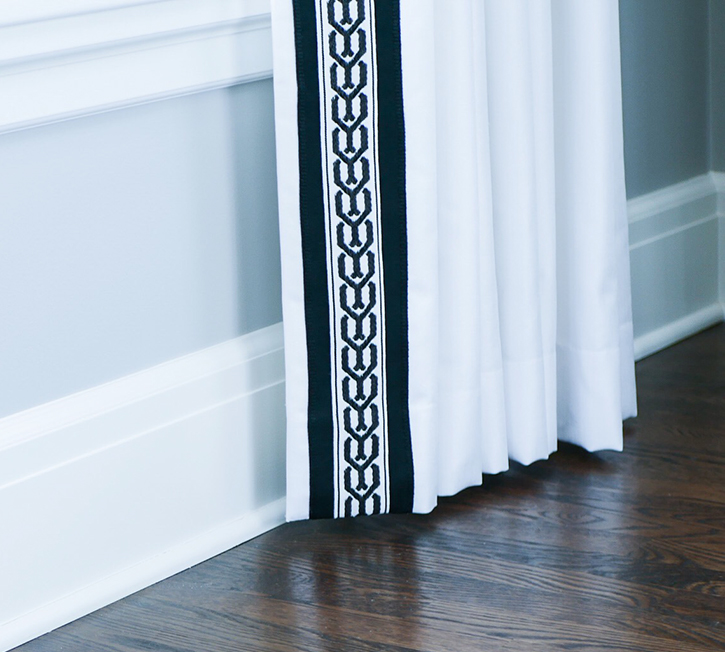
Tip 2: Use performance Indoor/Outdoor Trims “inside”. They will wear like iron!
Paula used an indoor/outdoor tape on the draperies. “Drapes are constantly hit by the sun, that is why I use performance fabric and trim in my interiors to prevent color fading.”
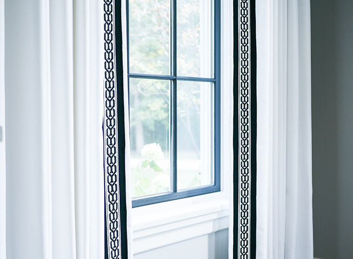
Tip 3: Drapery hardware should connect to something in the room, like a chandelier or piece of furniture.
If you have Lucite chairs or lamps, a Lucite drapery rod might be in order. Paula chose the Cube Collection by Brimar because the sophisticated square Lucite poles and silver metal rings, brackets and endcaps coordinated beautifully with the crystal and silver metal in the chandelier. Also, “the rod is light and doesn’t draw a lot of attention like a heavy wood or metal rod. Another nice feature – the brackets have a swivel base that can be positioned horizontally or vertically. This versatility is helpful when there’s space limitations between the molding and window frame. Brimar custom cut each rod to precisely fit every window frame.”
VIEW HARDWARE COLLECTION
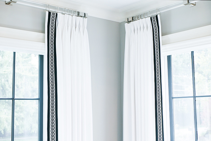
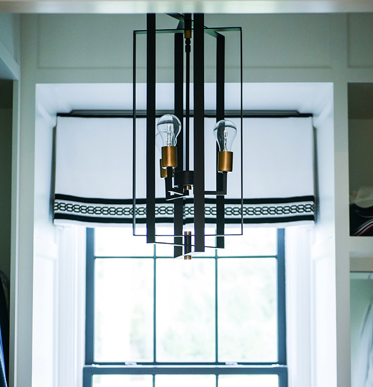
Tip 4: A little detail goes a long way.
“I carried the identical trim design concept to the shade in the His and Her closets. However this time I turned the trim on its side to run horizontally. Trim completes a window design however small. Every detail really does count!”
Tip 5: Consistent styling throughout a home creates calm uniformity.
The black and white theme was also carried to the upstairs guest bedroom. Draperies hang from a modern square metal rod from Brimar’s Innova Collection. The channel track operates drapery panels with traverse glides. “It’s a clean look without rings and comes in long lengths. This 16-foot rod is one piece.” Paula was able to create an entire wall of draperies across three windows.
VIEW INNOVA COLLECTION
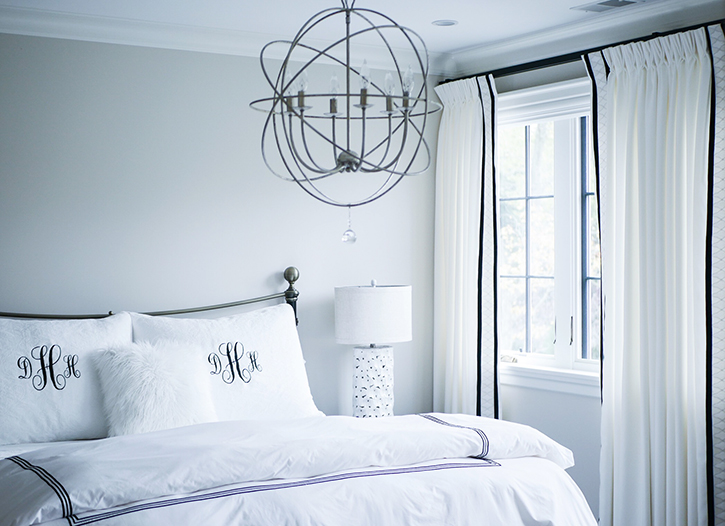
Tip 6: Apply custom details to make your designs stand out.
Again, Paula bumped up the overall look of the drapery edge by sandwiching a diamond-patterned tape between two black borders. The dark borders against the white fabric really grab the eye.
VIEW 1″ BORDERS
VIEW 1 1/2″ BORDERS

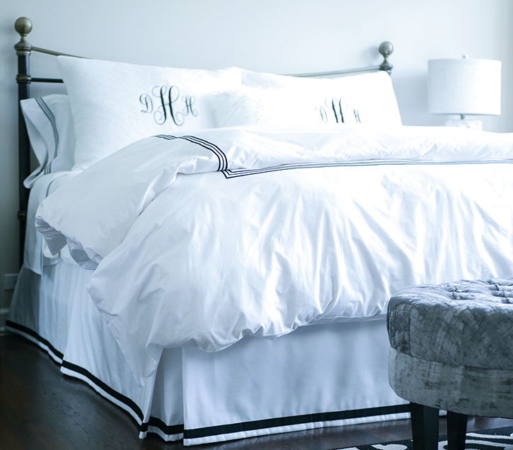
A black grosgrain border was applied to the bedskirt to complement the design in the duvet. These are the details that make a room visually interesting.
VIEW MICROCORDS & TAPES COLLECTION
Brimar extends a big Thank You to Paula Fioretti for sharing her design insight and to her client for opening up their lovely home. Keep making homes beautiful!!!
Decorative Trim Drapery Hardware Indoor/Outdoor Trim Trimmings

Leave a Reply
You must be logged in to post a comment.